
■パッケージ:ggplot2
これからggplot2でグラフを創るよ。
データはこれを利用しよう。
コード
ggplot ( data = mpg ) +
グラフは棒グラフにしよう!
X軸はこれで、Y軸はその件数を数えてね。
geom_bar ( mapping = aes ( x = var1) , stat = "count")
■factor(因子) とは?
・男/女のように、カテゴリかる編スト呼ばれるものをRで表すときに使われる型
・as.factor(文字列型のベクトル)で作れる
・レベル(数字)とそれに対応したラベル(文字)で表現される
■geom_xxx()の考え方
geom関数は非常にたくさんある。Cheat Sheetが公式サイトに載っている。
(https://rstudio.com/wp-content/uploads/2015/03/ggplot2-cheatsheet.pdf)
geom_bar()
ggplot(data = iris) + geom_bar(mapping = aes ( x Species))
geom_histogram()
ggplot(data = iris ) +geom_histogram ( mapping = aes ( x = spal.length))
※X軸の変数名のしてのみでOK.

■library(ggplot2)を実行すると
以下のデータが含まれている
diamonds
economics
msleep
#diamonds:50000個のダイヤモンドのデータ
#price -> 値段
#carat ->重さ
#cut -> カットの質(カテゴリカル変数)
#color -> 色(カテゴリカル変数)
#clarity ->ダイヤの透明度(カテゴリカル変数)
#x,y,z -> 長さ、幅、深さ
#ほかの変数も
# ?economics
#というように「?」を付けると内容を確認できる。
#------------------------------------------------------------------実行例-------------------------------------------------------------------
#例題:ダイヤモンドの長さ(x)と幅(y)の関係を散布図で描画
ggplot ( data =diamonds ) + geom_point(mapping = aes(x=x,y=y))

#演習1
#ダイヤモンドの重さと値段の関係を散布図で描画する
ggplot(data = diamonds ) +
geom_point ( mapping = aes ( x = carat, y = price))

#colorを付ける aes の中を変える
ggplot(data = diamonds ) +
geom_point ( mapping = aes ( x = carat, y = price,color = cut))

#演習2
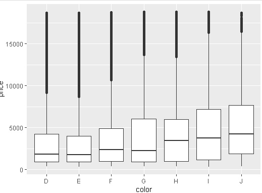
#ダイヤモンドの色と値段の関係を箱ひげ図で描画する
ggplot(data = diamonds ) +
geom_boxplot ( mapping = aes ( x = color, y = price))
#演習3
#ダイヤモンドの透明度と色の関係を何らかの形で描画してください
gdaia <- ggplot ( data = diamonds )
gdaia + geom_count ( aes ( clarity , color ))

gdaia + geom_jitter ( aes ( clarity , color ))

#演習4
#ダイヤモンドの値段の分布をヒストグラムにして描画する
gdia + geom_histogram(aes(price))
#全てコードを記載した例
ggplot ( data = diamonds ) + geom_histogram ( mapping = aes ( x = price))

#ヒストグラムようなものでは、colorではなく、fillを指定する
ggplot ( data = diamonds ) + geom_histogram ( mapping = aes ( x = price,fill = cut))

#タイトルをつける
#タイトル:「ダイアモンドの値段分布」
#X軸:「値段(ドル)」 Y軸:「件数」
ggplot(diamonds) + geom_histogram(aes(price, fill=color)) +
labs(title = "ダイヤモンドの値段分布",
x = "値段[ドル]",
y = "件数")


#凡例操作
#library(tidyverse)
graph <- ggplot(diamonds) + geom_histogram(aes(x = price, fill = clarity))
graph
#凡例をけしてみる guide = FALSE
graph + scale_fill_discrete(guide = FALSE)

#タイトルをいじる
graph
graph + scale_fill_discrete(name = "透明度")

#表示される順番を変えてみる
graph
graph +
scale_fill_discrete(breaks = c("I1", "IF", "VVS1",
"VVS2", "VS2", "VS1", "SI2", "SI1"))

#透明度とは、ダイヤモンドに含まれる微少な包有物それを凡例に表示する
#I1:含まれる
#SI2:わずかに含まれる
#SI1:わずかに含まれる
#VS2:ほんのわずかに含まれる
#VS1:ほんのわずかに含まれる
#VVS2:ごくごくわずかに含有
#VVS1:ごくごくわずかに含有
#IF:内部が無傷
#ラベルを付ける
#clarityの順番を見る
levels(diamonds$clarity)
#上記の実行結果で表示された順番に、変数に格納
text_label_of_clarity <- c("含まれる",
"わずかにSI2","わずかにSI1",
"ほんのわずかにVS2","ほんのわずかにVS1",
"ごくごくわずかにVVS2","ごくごくわずかにVVS1",
"内部が無傷")
graph
graph + scale_fill_discrete(labels = text_label_of_clarity)
-------------------------------------------------------------------------------------------------------------------------------------------
#説明
mapping = aes () のaesはaesthetic=エステティック(美的)の略。
aes ( )の中に色等の設定が可能
・color :点や線に色が付けれる
■テーマの設定
#色々なテーマを集めた、ggthemesパッケージというものがあります。
install.packages("ggthemes")
graph + ggthemes::theme_base()
graph + ggthemes::theme_calc()
graph + ggthemes::theme_economist() #Economist(雑誌)とにたテーマ
graph + ggthemes::theme_economist_white()
graph + ggthemes::theme_excel() #説明分がひどいです・・・「絶対につかわないで」
graph + ggthemes::theme_few()
graph + ggthemes::theme_fivethirtyeight()
graph + ggthemes::theme_gdocs()
graph + ggthemes::theme_stata()
graph + ggthemes::theme_wsj() #Wall Street Journalとにたテーマ